Designing the Messaging Provider Experience
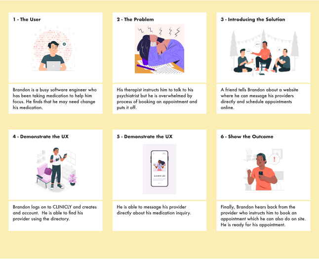
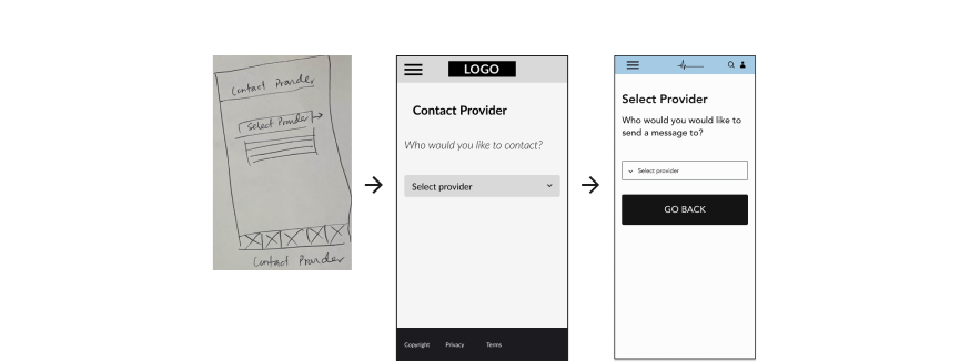
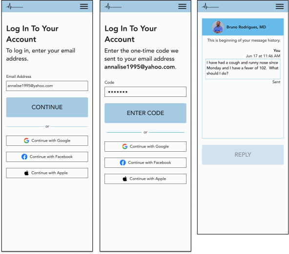
The other set of key screens were the screens that were apart of the the user flow for messaging a provider. Again, I wanted to consider what was learnable and memorable in terms of users learning how to navigate through the screens. But I also wanted to make sure users weren’t overwhelmed by this process and thus, I mimicked MyChart’s organization of this flow that gave each step a unique screen. I eventually incorporated a go back button for each screen as visualized below in order to give the user more control over their actions and allow them to recover from an potential errors. I also incorporated clearer helper text to guide user’s actions. mimicked MyChart’s flow for messaging a provider, also allowing users to indicate the type of message and specific provider they would like to contact.
Branding
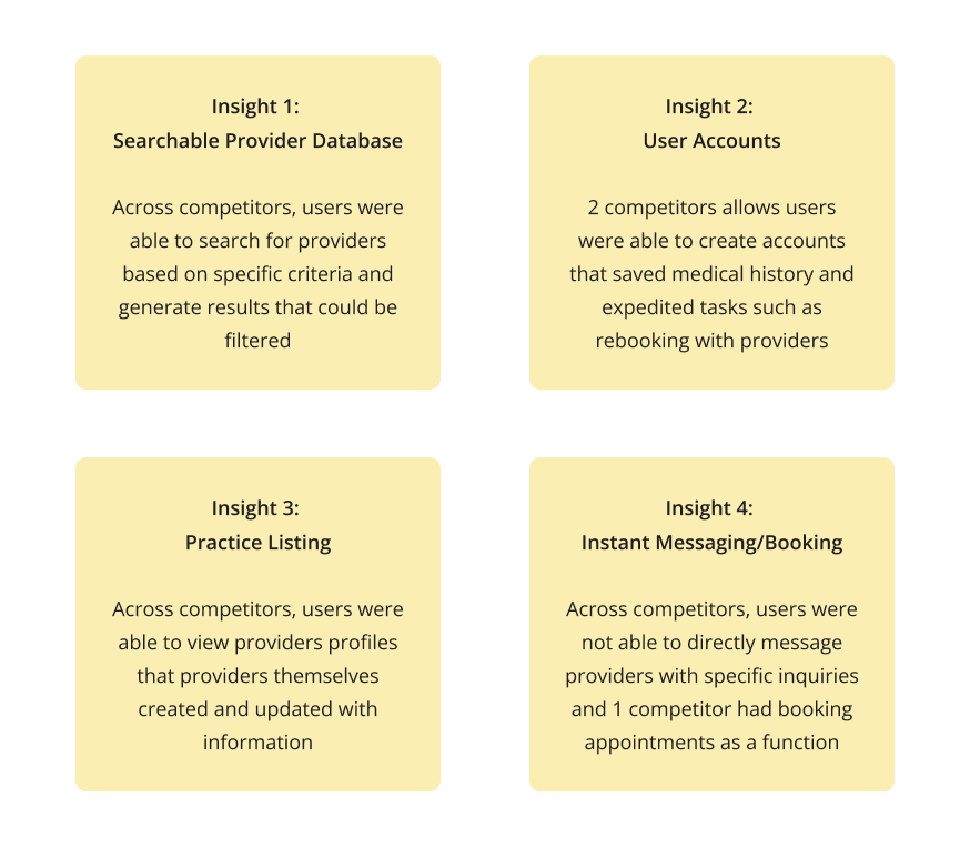
I thought it was important to create a brand that put users at ease who might be sick and/or in distress when they are navigating the website. Thus I was drawn to a really light blue with a orange contrast color for highlights. I presented three different logos I had sketched to other designers and received feedback that one logo in particular looked seemed to fit the overall vibe in my style tile. The following words were used:
This was the exact vibe I was aiming for and so I decided to move forward. I continued to experiment with the thickness of the lines to make sure logo was actually readable as it scaled to different sizes. For consistency, I incorporated components that were equally as simple and clean typically using black against a light background for a level contrast and accessibility. I was able to check for contrast using the Coloors contrast checker online.
Component Design
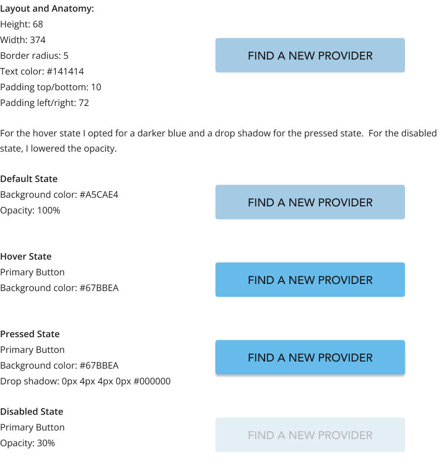
For the button design, I made sure there was enough padding around the text. It was important to make sure the text size was large enough for readability and that the text was bold and all caps. I chose the blue for the button to create a sense of calm on the different screens. I also opted for a rectangular shape with a slight curve on on the corners for the primary button. It was important to prove enough padding around the buttons label. I put the label in the body font type and size, but all caps to make it stand out and still be readable. I used similar specs for all buttons and adjusted them for the mobile version as well in order to create overall consistency and similarity throughout the component design.
Usability Testing
Once I had finished creating a prototype for the sending a message flow, I began usability testing. I used the same 5 users who I had conducted user interviews with for the usability testing.
The goal was to determine if the flow was intuitive to the user given the task of messaging a provider.
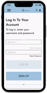
Users testing the website needed to log in, sending a new message to their provider and view their sent message. As a designer, I was concerned with how intuitive and simple the flow was and whether it was what users expected to experience. My quantitative success metrics were the task completion rate and the user rating of difficulty (1 to 5, with 5 being the most challenging). My qualitative success metrics were user’s feedback on their experience with the website.
Feedback Prioritization
All users were able to successfully send a message to their provider. Users also rated the task as relatively easy to complete.
After sorting the user feedback, I rated it by severity to the user’s journey considering what might impact the user’s ability to message their provider.
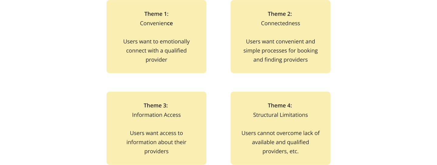
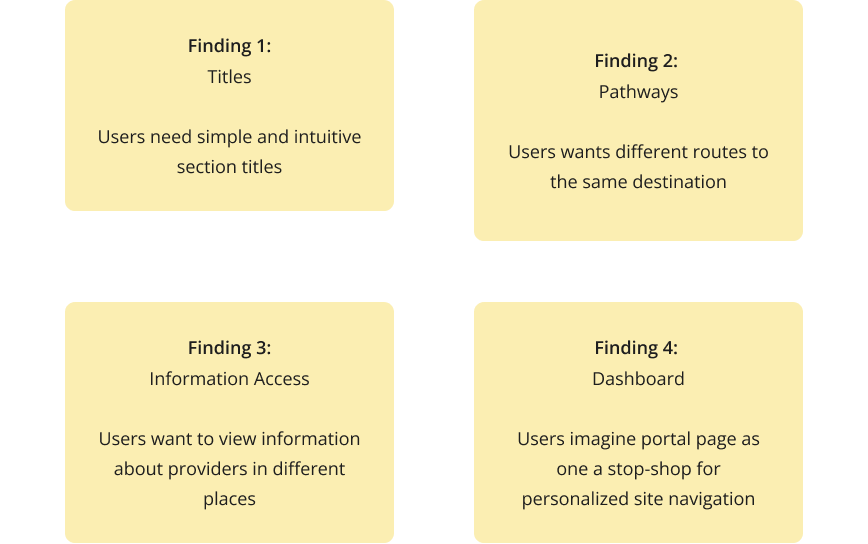
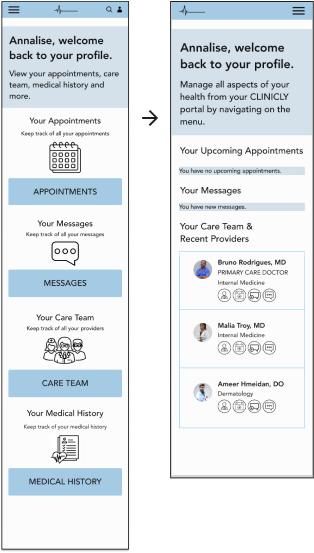
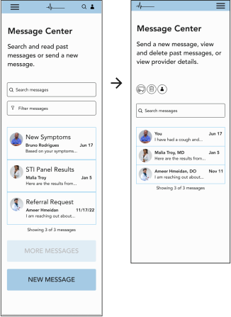
I found that issues related to making portal home screen and the message center screen to be most severe as users indicated that it was not very intuitive what actions they could take on these screens.
"
It’s definitely my instinct to click on the menu. In fact, I would prefer to click on menu to see all my options rather than having to scroll through this page or explore the website. "
"
If I am sick, I would want to be able to get into contact with my provider as quickly as possible once logged in. "
Priority Revisions
I focused my iterations on the portal home screen and the message center screen and how I could make the user actions more intuitive.
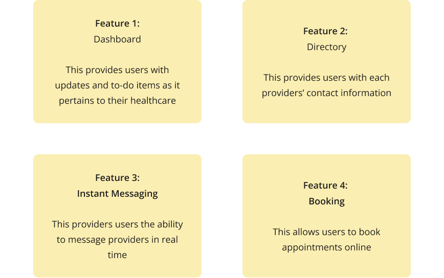
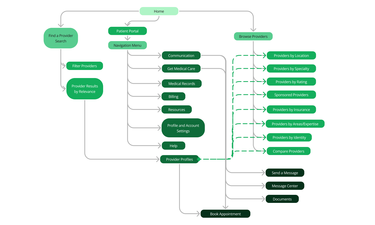
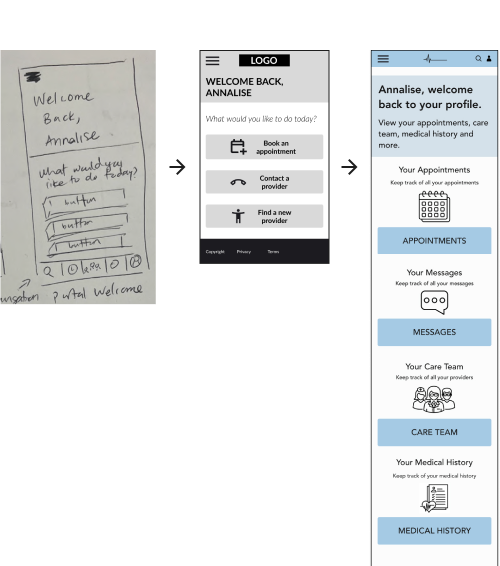
I reworked the portal page view to emphasize the hamburger menu which holds all user actions rather than the cards on the portal page. The approach of centralizing the hamburger menu allows for progressive disclosure, rather than overwhelming users with a number of various actions. I also incorporated a dashboard and provided actions tied to each provider for the user.
I moved the buttons closer to the top of the screen so that users could make decisions about what they wanted to do on this screen without having to scroll. By moving the actions to the top of the screen, I created a better information hierarchy for users clicking on this screen.


